Evan Marnoch articulates well my thoughts on the new Jets logos.
Let's get the secondary logos out of the way first. This logo, which I presume is a shouder patch, is very nice. I approve! This alternate scripty-looking logo is not good at all. It's disjointed and clumsy, and the plain sans serif WINNIPEG does add anything. I hope they reconsider this one.
 Now on to the main logo. I don't think it's bad, but it could be better. Evan does too, saying this:
The main logo could have been so much stronger if they were able to cut ties with the maple leaf ... The shape of the plane alone occupies a similar shape to the leaf and I think it, along with utilizing similar colours (ie. blue circle & red plane), would have been enough. Sure, some people might miss the reference. But for those that would get it - it would allow them to feel closer to the concept, as if they were in on the reference. This would have created a much bolder mark. Much more identifiable. Instead - they tried to do too much by including both images.The plane superimposed on top of the leaf looks forced and uncomfortable to me. You have too many pointy things everywhere. This logo has bad feng shui, plus the red little pointy tail beneath the plane bugs me because that is not part of the maple leaf. It's like they took the top part of the leaf and stuck it where the stem is supposed to be, or turned the maple leaf into a jet plane flying south.
Thoughts? Better? Too plain? (Too plane?)
original logo soure
h/t Brent Lauman
UPDATE ****************************************
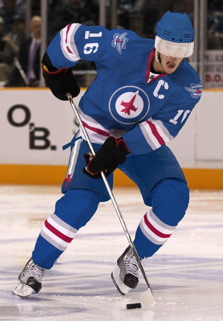
Right, well it appears that I wasted my time modifying the logos. Some guy not only made the exact same change, but went through the trouble of mocking up the uniforms on Jonathan Toews. I only hope he spent more time on it than I did:
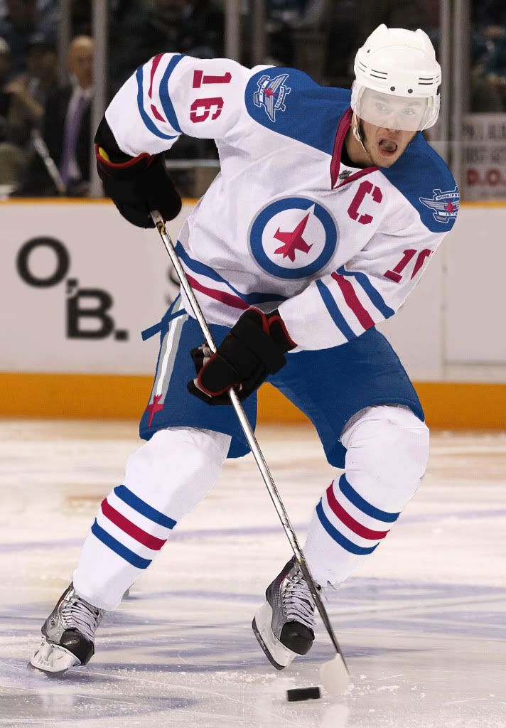
 source
h/t: shifty

4 comments:
I don't mind the logos. Though I agree that the "Winnipeg Jets" is my least favourite of the trio. it looks sort of like a beer label.
I, too wondered what the maple leaf is supposed to have morphed into under the jet figure. At the very least they should tweak it to ditch the tail where the stem is supposed to be.
I thought the Nordiques went to Colorado?
Good job. The paint over jerseys remind me of those old O Pee Chee paintovers: awful hockey card art
http://www.lighthousehockey.com/section/awful-hockey-card-art
@Gustav: Yes sir, they did. That's a commentary on colour of the jerseys I presume? Maybe a silver with blue shoulders and pants would look better...
@MrC: It didn't even occur to me that those cards from my youth might have been frauds. I am going to bed tonight as a disillusioned man.
Post a Comment