What can I say? Amazing first game here in Winnipeg. Just a few of photos from the game:


Last 20 seconds of the first Jets WIN in 15 years!:
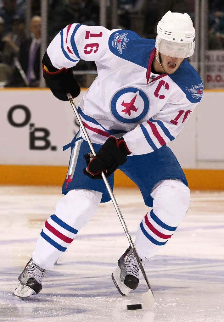
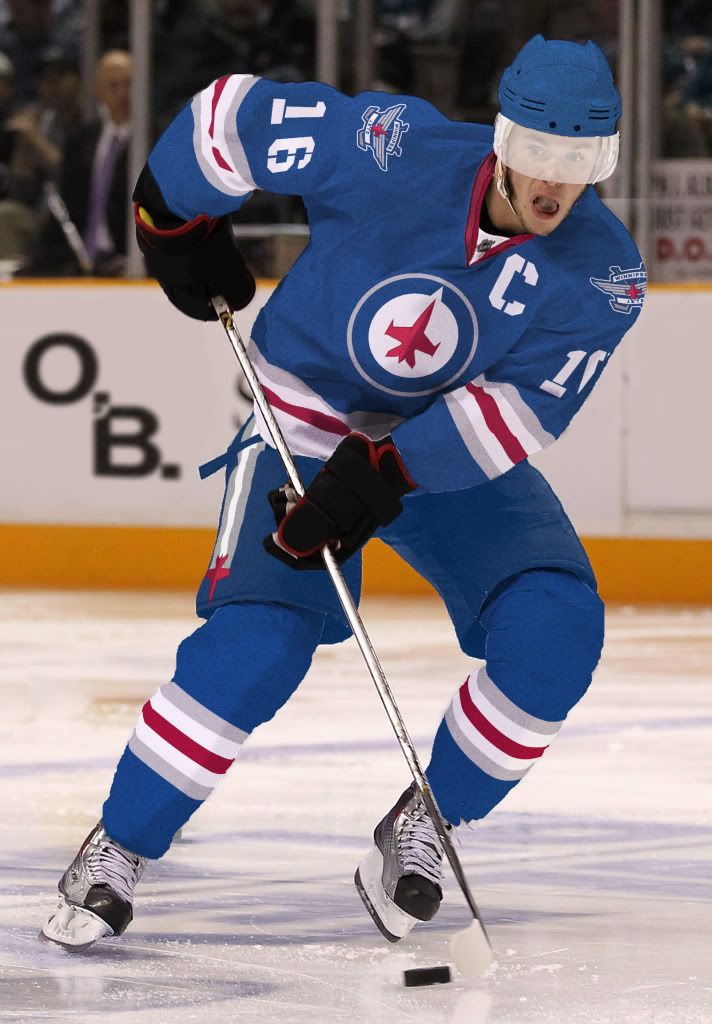
Hey there. Here is a quickie post to let you know that I'm still alive. Due to a recent career change the posting has been a little sparse lately, but I can't let something as important as the Jets uniforms to go uncommented.

Evan Marnoch articulates well my thoughts on the new Jets logos.
Let's get the secondary logos out of the way first. This logo, which I presume is a shouder patch, is very nice. I approve! This alternate scripty-looking logo is not good at all. It's disjointed and clumsy, and the plain sans serif WINNIPEG does add anything. I hope they reconsider this one.
 Now on to the main logo. I don't think it's bad, but it could be better. Evan does too, saying this:
The main logo could have been so much stronger if they were able to cut ties with the maple leaf ... The shape of the plane alone occupies a similar shape to the leaf and I think it, along with utilizing similar colours (ie. blue circle & red plane), would have been enough. Sure, some people might miss the reference. But for those that would get it - it would allow them to feel closer to the concept, as if they were in on the reference. This would have created a much bolder mark. Much more identifiable. Instead - they tried to do too much by including both images.The plane superimposed on top of the leaf looks forced and uncomfortable to me. You have too many pointy things everywhere. This logo has bad feng shui, plus the red little pointy tail beneath the plane bugs me because that is not part of the maple leaf. It's like they took the top part of the leaf and stuck it where the stem is supposed to be, or turned the maple leaf into a jet plane flying south.
 source
Back in high school we had a phys ed teacher named Schram. He had a first name, but nobody used it. Anyhow, one of almost every student's favourite activities during phys ed class was a sport we dubbed "Schram ball". The rules are as follows:
1. there is a net in opposite corners of the gym
2. put the ball in the other team's net
Those are the rules. You can kick the ball, throw the ball, carry the ball. You can body check, grab, tackle. Whatever you want. I suppose eye gouging was frowned upon, but there was no explicit rule against it.
I tell you this, because last night's game 7 Stanley Cup final was not unlike Schram Ball. It was not the same sport that the Canucks excelled at during the regular season. It was a slightly different sport. One where slashing, holding and interference were legal. Now, I am generally a fan of physical hockey and "letting them play", but you don't need dirty hockey to have an exciting game. The 2011 Winter Olympic final is a good example of that.
Set the tone early by chucking people who hold or interfere into the bin, and then pull back a bit and refrain from calling any marginal stuff. That gets you good hockey. You know, I'm not sure that Aaron Rome's hit that earned him a 4 game suspension would have even earned him a minor penalty last night.
And this is certainly no excuse for the rioting after the game. That unfortunate debacle could ruin the chances of us watching the Jets on the big screen at 201 Portage if they ever make a playoff run. However, when you get so far only to have the rules changed on you, it would be very aggravating. Especially when the new rules hurt your best players and favour the other team.
It was certainly a deliberate decision - one that the refs discussed prior to the game. Perhaps they even received direction from league VP of Hockey Operations Mike Murphy on how to call the game. The same Mike Murphy who suspended Rome for 4 games based not on precedent, but on a gut feeling. The same Mike Murphy who overturned a Canuck goal in the first round last year upon video review, then later admitted it was the wrong call -- according to this wiki article.
Whoever made the decision, it's something for the league's owners and new director of officiating to think about before next year's playoffs. (note: I am a little bit bitter because I was cheering for the Canucks, so you can take that into account. )
related local post: S&M
As a Winnipeg blogger I am obligated by an obscure bi-law to write a post about the return of the NHL to our fair city. Okay, I'll do it, but it will be mostly pictures.
The long awaited moment -- even longer awaited than IKEA -- has finally come! The press conference this morning confirmed it. Chipman was professional and passionate in his announcement. Bettman looked like he was telling his patient that he had inoperable brain cancer. Premier Selinger's speech went something like this:
It's such a pleasure to be here for this announcement. It wasn't long ago that we retired Mark Keane's jersey. Mark was such an outstanding player and he sold me a great mattress. No wait, that was David Keane. Haha. Yooooouuuu'll find us! I love that guy! Except he drives too fast. No wait, that was Steve McQueen. Great actor. Loved it when he sang happy birthday to the President. No wait, that was Norma Jean. Norma Jean is not my lover.She's just a girl that says I am the one. Haha. Where was I? Oh right, welcome back to the NFL!